| We are working on graphic design based on typography. And we are interested in using various visual languages as a means of communication. We produce a diverse range of work across multiple disciplines that includes graphic design, editorial design, exhibition design, information design, signage design and brand design.
| 가장 가치 있는 브랜드는 사람들이 경험하고, 기억하고, 공유할 수 있는 이야기를 만들어냅니다.
| SIMPLE, CLEAR, HARMONY, BALANCE >>> MAKE A RULE. | We use a variety of communication methods to guide our customers through their brand experience journey. From the birth of a brand to its expansion by creating a methodology through simplicity, clarity, harmony, and balance. We are working on brand experience design.
| Creative Directing & Consulting | Brand Design, Graphic Design, Book Design, Information Design, Exhibition Design, Sign & Space Design, etc. Design | Strategy & Consulting / Design & Planning >>> Brand Experience
| hoons79@gmail.com | +82.(0)10.2541.8550 | instagram | behance | kimsunghoon.co.kr
about hej
kim sunghoon ︎︎︎
2025
︎YVON LAMBERT: ALONGSIDE THE ARTISTS (Poster)
︎Laurent Grasso: MEMORIES OF THE FUTURE (Goods)
︎579th Birthday of Hangeul (Poster)
︎Laurent Grasso: MEMORIES OF THE FUTURE (Leaflet)
︎Laurent Grasso: MEMORIES OF THE FUTURE (Poster)
︎Laurent Grasso: MEMORIES OF THE FUTURE (Exhibition Graphic Design)
︎Laurent Grasso: MEMORIES OF THE FUTURE (Exhibition Title)
︎ETERNO, ETERNO APGUJEONG (Brand Book)
︎ETERNO APGUJEONG (Brand Book)
︎ETERNO APGUJEONG (Brochure)
︎ETERNO APGUJEONG (Super Graphic)
︎Honey SaSha (Branding)
︎ETERNO (Brand Book)
︎happy new year 2025
2024
︎MEMORY(Book)
︎ETERNO (Brand Fonts)
︎ETERNO (Architectural philosophy)
︎ETERNO (Brand Philosophy)
︎ETERNO (Brand Identity)
︎578th Birthday of Hangeul (Poster)
︎Markus Lüpertz: Sins, Myths and Other Questions (Exhibition Book)
︎Markus Lüpertz: Sins, Myths and Other Questions (Exhibition Leaflet)
︎LEIKO IKEMURA: Light on the Horizon (Exhibition Book)
︎LEIKO IKEMURA: Light on the Horizon (Exhibition Poster)
︎ETERNO CHEONGDAM Sign System (Signage)
2023
︎577th Birthday of Hangeul (Poster)
︎Anselm Kiefer: HERBST(Exhibition Poster)
︎Anselm Kiefer: HERBST(Exhibition Book)
︎Anselm Kiefer: HERBST(Exhibition Design)
︎Lee Jeong-gi, a pilgrim who follows the sound (Book)
︎Korean Photography Inside Out, 1929-1982 (Photo Book)
︎Korean Photography Inside Out, 1929-1982 (Photo Book)
2022
︎Korean Photography Inside Out, 1929-1982 (Exhibition Poster)
︎MUSEUM HANMI SAMCHEONG (Book)
︎20 YEARS OF THE MUSEUM OF PHOTOGRAPHY, SEOUL (Book)
︎LAPENTHILL (Brand Book)
︎A New Encounter, Immersive Gallery of Korean Art (Exhibition Leaflet)
︎A New Encounter, Immersive Gallery of Korean Art (Exhibition Graphic)
︎A New Encounter, Immersive Gallery of Korean Art (Exhibition Poster)
︎LAPENTHILL (Billboard)
︎LAPENTHILL (Application 2)
︎LAPENTHILL (Application 1)
︎LAPENTHILL (Branding)
︎576th Birthday of Hangeul (Poster)
︎LUXIA (Brand Book)
︎Honey SaSha (Brand Movie)
︎Honey SaSha (Branding)
︎LUXIA (Billboard)
︎LUXIA (Brand Book)
︎LUXIA (Letter of Invitation)
︎LUXIA (Brand Movie)
︎LUXIA (Branding)
︎hej (Branding)
2021
︎MOMENT BY MOMENT, WE SAY ‘NO CONCEPT BUT GOOD SENSE’ (Brand Book)
︎87MM ILSANG FONT FAMILY (Font Movie)
︎87MM ILSANG FONT FAMILY (Font)
︎THE A.TION (Application)
︎THE A.TION (Branding)
︎Happy New Year 2022 (Poster)
︎2022 hej (Calendar)
︎575th Birthday of Hangeul (Poster)
︎ETERNO CHEONGDAM (Brand Book)
︎ETERNO CHEONGDAM (Brand Book)
︎ETERNO CHEONGDAM (Brand Customize Book_Double)
︎ETERNO CHEONGDAM (Brand Customize Book_Single)
︎ETERNO CHEONGDAM (Brand Application)
︎K ONE (Branding)
︎korecipe (Package)
︎korecipe (Branding)
︎2020 Kakao’s Commitment and Responsibility (Report)
︎KCC (Brochure)
︎WEMADE shift (Mask & Strap set)
︎buddyBUDDY (Branding)
︎hej (Goods)
Before 2021
︎Stardust, Black & White (Poster)
︎SHIFT (WEMADE Brand Extension)
︎WEMADE, SHIFT (Mask Kit)
︎574th Birthday of Hangeul (Poster)
︎Dokkaebi (Book)
︎BIG-GAME: EVERYDAY OBJECTS (Book)
︎Kang Yoon Sung, Graphic Design Story (Book)
︎Beautiful Building in the City 2020 (Calendar)
︎Happy New Year 2020 (Poster)
︎Currency War (Poster)
︎Exhibition of 100 Years of Democracy in Korea (Book)
︎Exhibition of 100 Years of Democracy in Korea (Exhibition Design)
︎Exhibition of 100 Years of Democracy in Korea (Poster)
︎March 1st Independence Movement and Establishment of Provisional Government of Korea (Poster)
︎573th Birthday of Hangeul (Poster)
︎Gwangju Design Biennale 2019 (Book)
︎Junglim Architecture (Branding)
︎Bauhaus Dessau, 100 Years of Bauhaus (Poster)
︎March First Independence Movement (in 1919, against the Japaness colonial rule) (Poster)
︎Happy New Year 2019 (Poster)
︎572th Birthday of Hangeul (Poster)
︎wecampaign (Branding)
︎Hangeul, 14 Consonant Letter (Poster)
︎571st Birthday of Hangeul (Poster)
︎570th Birthday of Hangeul (Poster)
︎Birthday of Hangeul (Branding)

| we are working on graphic design based on typography. and we are interested in using various visual languages as a means of communication. we produce a diverse range of work across multiple disciplines that includes graphic design, editorial design, exhibition design, information design, signage design and brand design.
| 가장 가치 있는 브랜드는 사람들이 경험하고, 기억하고, 공유할 수 있는 이야기를 만들어냅니다.
| SIMPLE, CLEAR, HARMONY, BALANCE >>> MAKE A RULE. | We use a variety of communication methods to guide our customers through their brand experience journey. from the birth of a brand to its expansion by creating a methodology through simplicity, clarity, harmony, and balance. We are working on brand experience design.
| Creative Directing & Consulting | Brand Design, Graphic Design, Book Design, Information Design, Exhibition Design, Sign & Space Design, etc. Design | Strategy & Consulting / Design & Planning >>> Brand Experience
| hoons79@gmail.com | +82.(0)10.2541.8550 | instagram | behance | kimsunghoon.co.kr
about hej
kim sunghoon ︎︎︎
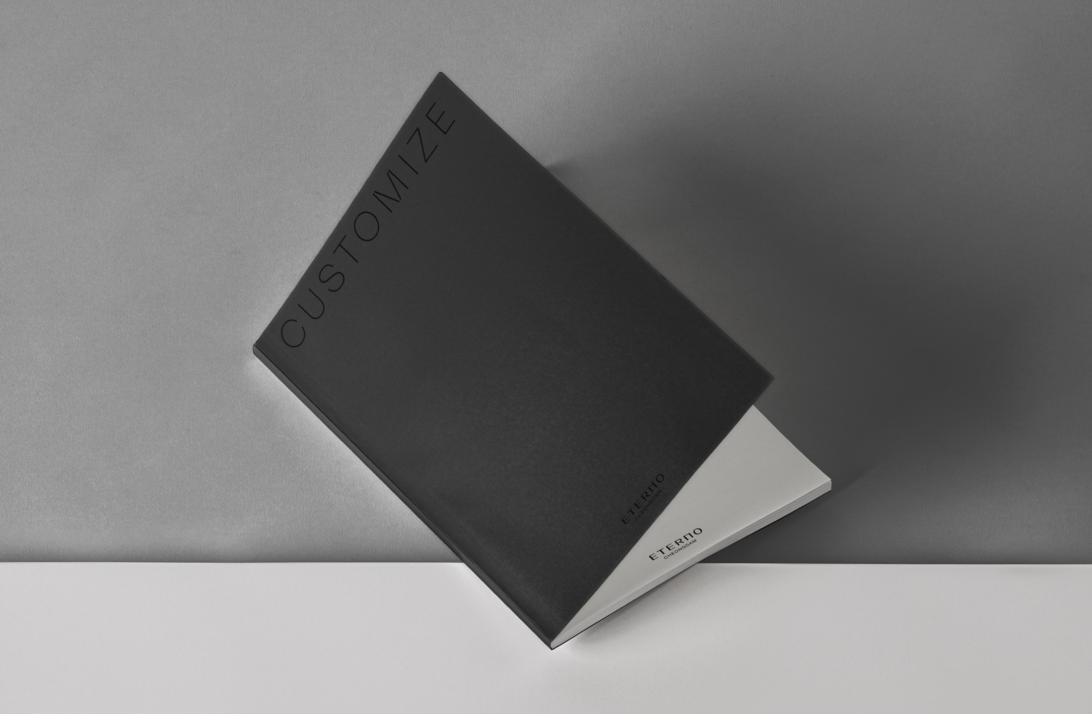

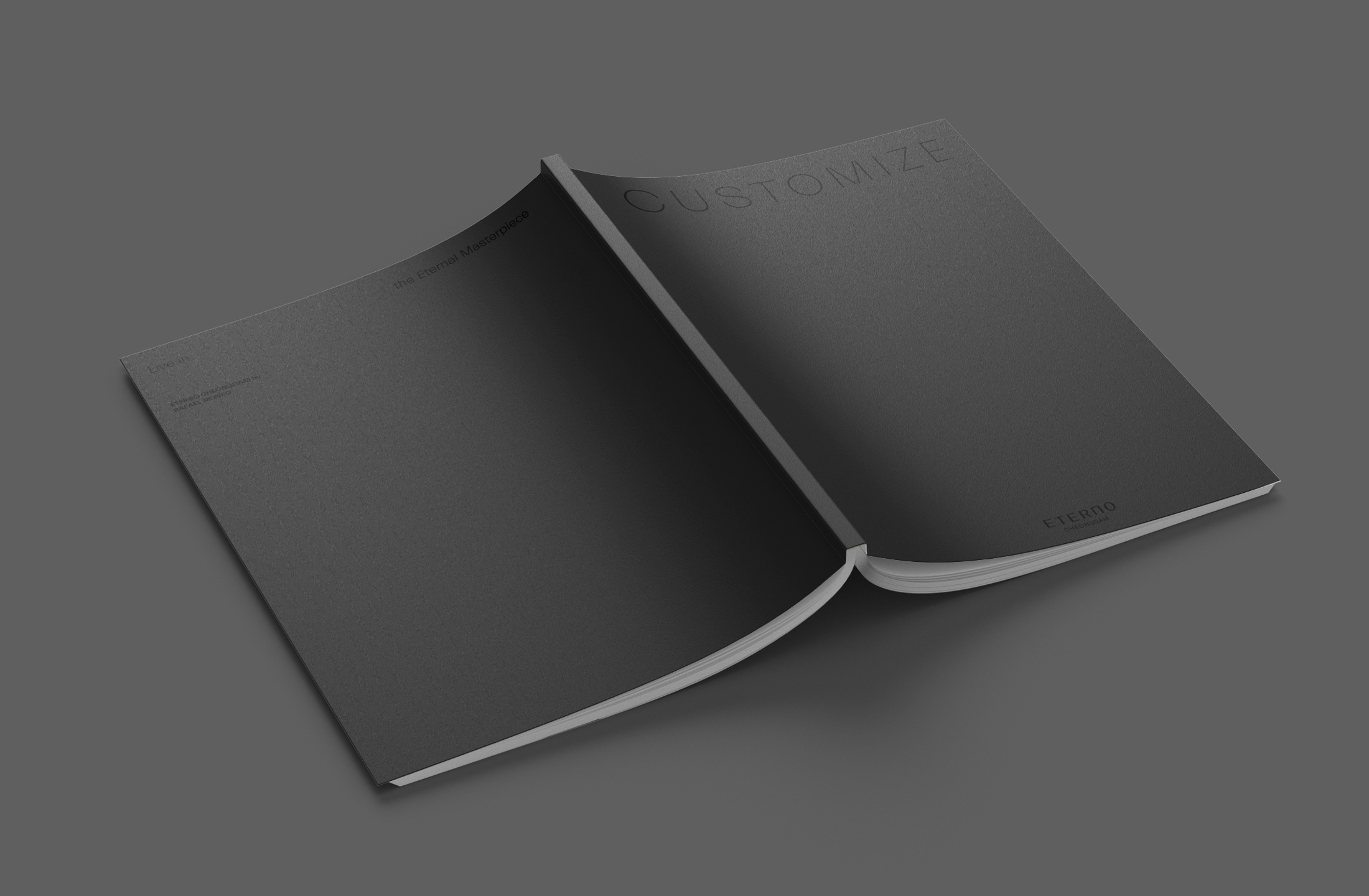
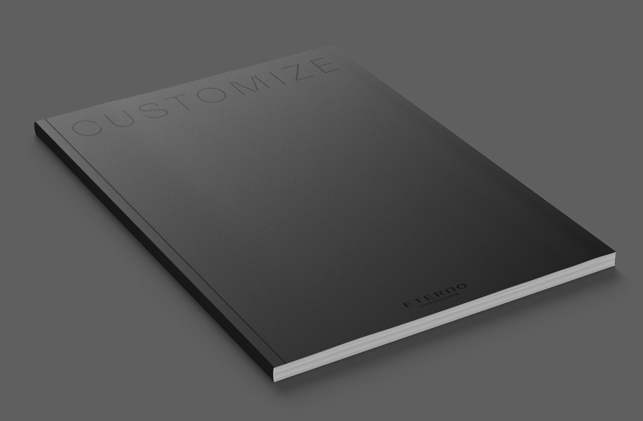


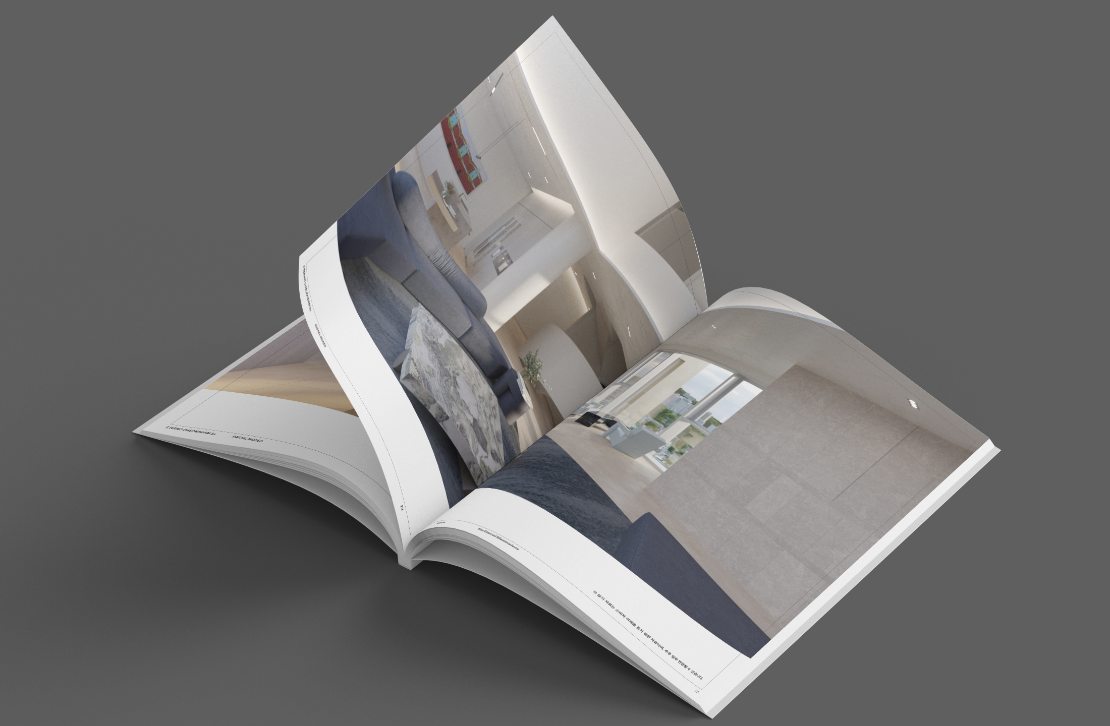
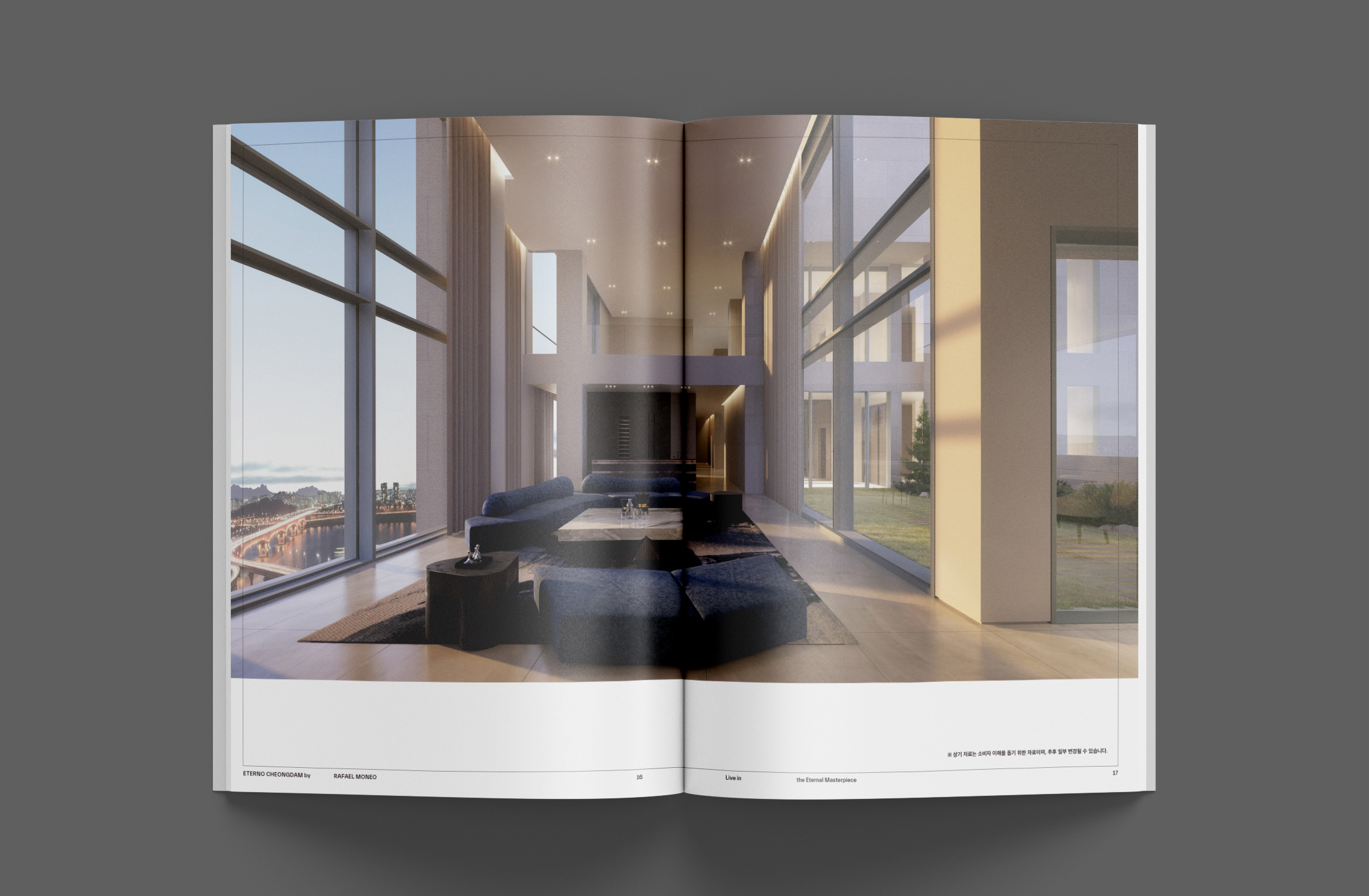

ETERNO CHEONGDAM
Customize Book (Double) / Branding
2021
220 x 300 mm, 106 page
Offset Print
Client: ETERNO
-
대한민국 최고의 주거 공간인 ETERNO CHEONGDAM의 커스터마이즈 북을 디자인했습니다. 청담동에 위치한 ETERNO CHEONGDAM은 한강변에 있어 한강과 남산 조망이 가능합니다. 건축계의 노벨상이라고 할 수 있는 프리츠커상을 수상한 스페인의 거장 라파엘 모네오의 아시아 최초 설계 작품으로, 단 29세대에만 허락된 최고급 주거 공간의 품격을 느낄 수 있습니다.
-
We designed an Customize Book for ETERNO CHONGDAM, the High-End-Apartment in Korea. ETERNO CHONGDAM, located in Cheongdam-dong, is located along the Han River, so you can see the Han River and Namsan Mountain. Famous singer IU purchased it and became famous and became known to the public. It is the first design in Asia by Spanish master Rafael Moneo, who won the Pritzker Architectural Prize, the Nobel Prize in architecture, and you can feel the dignity of High-End-Apartment allowed only for 29 households.